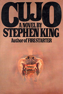
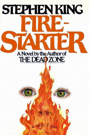
Netflix's "Stranger Things" is the latest binge-hole into which I lovingly poured my free time this weekend past. It's a wall-to-wall homage to 80s horror/sci-fi films and the work of Steven Spielberg, John Carpenter, Stephen King, Guillermo del Toro and the list goes on. The show drips with literal ooze and the figurative kind found in easter eggs and constant references to other 80s material that actually enhance the show, rather than ruin it. I'm not making a list, but I've seen references to The Evil Dead, The Thing, Star Wars, Cujo, Firestarter, The Dark Crystal, Alien, 2001: A Space Odyssey, and I'm sure TONS more.

The poster for Netflix's "Stranger Things"
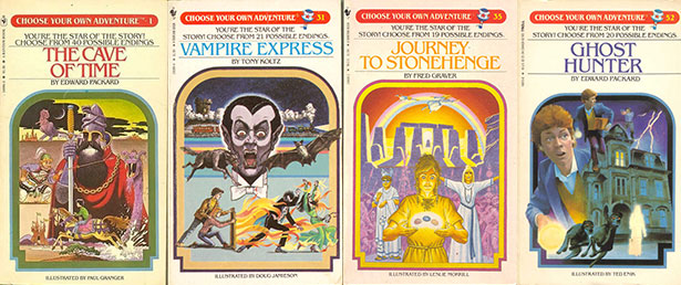
I had no clue this show was even a thing until I saw a billboard for it about a week ago. The poster has a pitch perfect title treatment that immediately puts you in a dated fantasy world. The type here echoes the covers of the "Choose Your Own Adventure" books as well as the covers of many Stephen King books.
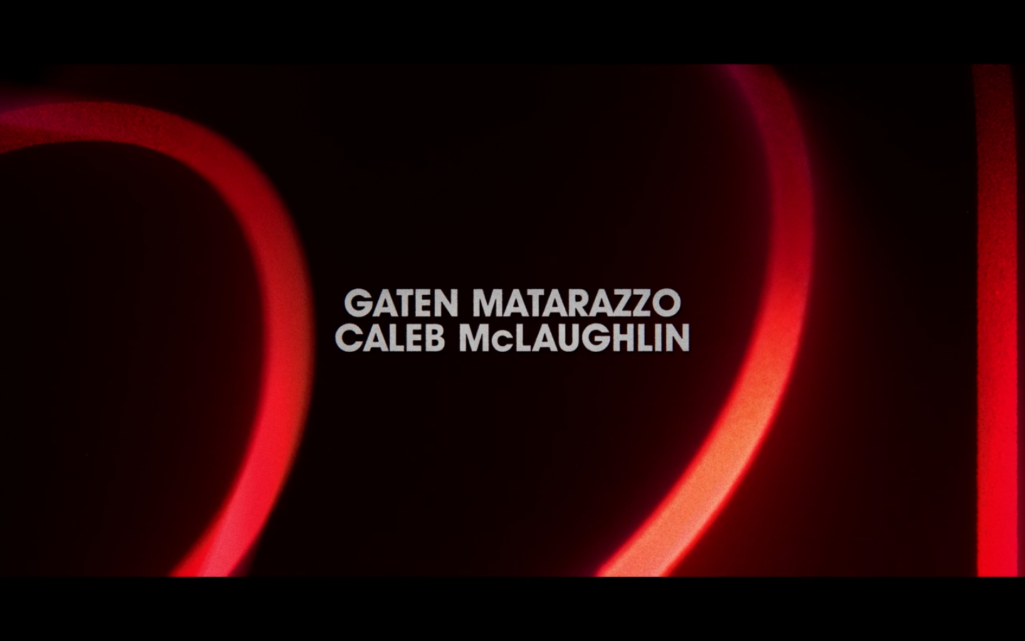
The tightness of the spacing is reminiscent of 80s type trends and I was happy to see they carried this look and feel through to the actual show's opening credits. Here are a few screencaps from the show illustrating how the type slides over itself and into place, reminding me a lot of another set of credits to a perfect 80s film, The Terminator (skip to 1:14 for the titles).


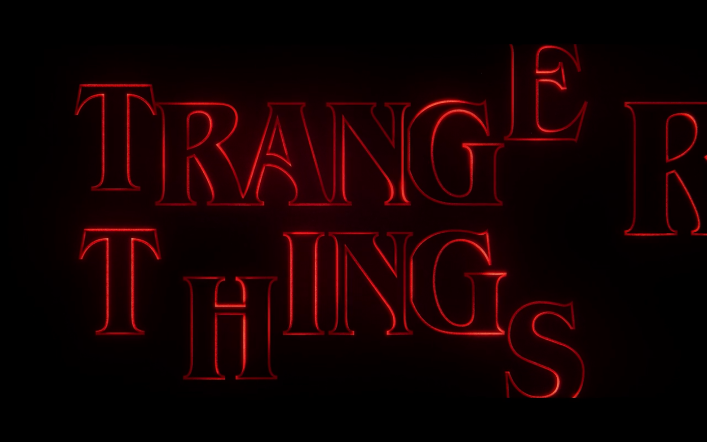


The type is ITC Benguiat (1977) and ITC Avant Garde Gothic (1970–1977) and they look pretty great here. There have been several modifications to the ITC Benguiat to make the tracking so tight: the bowl of the uppercase G has been cut away and the serif at the top of the uppercase S has been modified. Most notably, though, is the fact that small caps were not designed for ITC Benguiat, so the larger S and R are custom-scaled, as is the uppercase T, which extends slightly higher than the rest of the letters in "THINGS."
Either way tremendous job by whomever did the design and direction — sounds like the creators of the show had a heavy hand in it. The best part about a piece like this is that any small irregularities (like the fact that "THINGS" is slightly left of center and the spacing is a bit wonky) can be chalked up to the fact that it's supposed to feel like an imperfect piece of work. In an age before Adobe and in a format that could never provide ample time for dissection, why not make the analog aspects sing?
(No notes on the ITC Avant Garde, really, except that it's nice to see a designer not lose their mind and go totally overboard with the optional ligatures.)
ITC Avant Garde Gothic type specimen from MyFonts.com
Now, I decided to write about this show and the typography within for two reasons: first, as you can see above, the opening sequence alone made me feel like a kid again. Full disclosure, I was born in 1978 and grew up watching all of the things referenced in this show. No, none of my Star Wars action figures survived my youth.
The other reason for writing this is that I apparently now have enough experience working with type to say to my wife, "That's not from 1983. That's Avenir, which was designed by Adrian Frutiger in 1988." To which she rightfully responded, "Dork." As I kept watching, I noticed enough of these very deliberate shots of type to explain who/what/where aspects of the show and wondered if they'd all turn out to be anachronisms.
Avenir is the French word for "Future." There is no word for that uppercase P.
The side of the police chief's truck was the first typographic misfit that caught my eye. HAWKINS and DEPT. are set in Avenir Medium, while POLICE is set in Avenir Black. It took a minute to ID the word POLICE, though, since the P and O seem to have been edited a bit. The center bar of the P seems to have been raised slightly, while the O seems to have been stretched horizontally. Again, this could be the work of a detailed designer replicating the methods of the 1983 type application on the door of a car. Then again, why use a typeface from 1988 when your show takes place 5 years earlier? Additionally, and this is REAL nitpicking folks, don't you think that in reality it would take even longer than 5 years for a brand new typeface to reach the side of a small-town police chief's car? I'm just asking questions.
B-B-B-Benny and the Cops
Hey y'all — Lost Type Co-op in the house! Even more distinct than Avenir is Chandler Van De Water's Cubano, a typeface "defined by its rounded corners, wide strokes, and semi-condensed letterforms." As best I can tell Cubano was released in 2011, making it the 100% freshest component of Benny's Burgers. (I'm not sure what font "Benny's" is set in — feel free to comment if you know!)
Nothing to see here. I mean there's bodies in side, but other than that...
Rockwell, designed in 1934. Feels right to have this on the county coroner's office. I'll allow it.
Hmmmmmmmmmmm.
I've never been more frustrated by a police station than when trying to identify it's signage font. I've got a few potential candidates, though none seems totally correct; they are Gothic RR Medium Condensed (1999), Corpus Gothic Regular (1998), and Red Top (2012). Here's another shot:
Yep.
Let's move on.
White van! Run!
"HAWKINS" here is set in Kimberley Black, one of 7 weights available from Typodermic Fonts. Their site says they released the typeface in 2000.
Kimberley type specimen from MyFonts.com
"POWER AND LIGHT" is good old Helvetica. I don't think I need to say anything about Helvetica, other than it was around prior to 1983.
Gotham, designed by Tobias Frere-Jones in 2000.
Didn't catch this image until I showed the trailer for the show to someone at work. Thought it would be a simple ID since it's so similar to the Avenir "HAWKINS" that shows up all over the cop cars. This time it's actually Gotham (check out the arm and leg of the uppercase K), a geometric sans-serif based on building lettering around Manhattan, "especially the sign on the Eighth Avenue façade of the Port Authority Bus Terminal."
"You know I only date guys with yellow Trapper Keepers that have blue type on them, right?"
Not really fair here since it's an actual product from the 80s, but thought I'd include it anyway since it rules. The Trapper Keeper logo is set in Motter Tektura, a typeface designed by Othmar Motter in 1975 and never released digitally. Here's a nice piece on Tektura.
After identifying most of the type used in the show (DAMN YOU, POLICE SIGN!), the real question here is, do I enjoy the show any less after going through this exercise? With all the articles pointing out how detailed this show is and how many references it got right, my first impulse is to point out that the designers were a bit lazy when it came to selecting era-appropriate type. I mean, the big important title sequence was so on point, why get lazy when it came to a burger sign?
On the other hand, maybe all the pre-1983 type they could have used would have looked bad on camera? While Cubano (2011) seems outrageously weird to put in a 1983 show and sticks out like a sore thumb, Kimberley (2000) is really awesome and fits that sort of IBM/gov't conspiracy look quite well.
For me, understanding and analyzing only enhances and this show is a great enjoyment.